Welcome to week 2 of my working with colour challenge. This week, I’m challenge you to play with tints, shades and tones of your chosen hues.
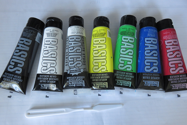
These are the base colours I’m using for my first challenges.
Challenge 2: Tints, Tones, Shades
First, a few definitions:
Hue
Pure colours are referred to as hues. The names of the hues in the 12 segment painter’s wheel are Yellow, Yellow Orange, Orange, Red Orange, Red, Red Violet, Violet, Blue Violet, Blue, Blue Green, Green, Yellow Green
Tint
Hues with white added to created lighter versions are called tints. Tints include, but are not limited to, pastels.
Tones
Tones are hues with grey added. Because grey comes in so many varieties, there can be a wide range of tones and they might be lighter or darker than the original hue.
Shades
Shades are created when black is added to pure hues. Shades are always darker than the original hue but can range from only slightly darker than the original to close to black.
Challenge 2: Tints, Tones, Shades
This week, your challenge is to play with tints, tones and shades of colours.
Some things to consider:
- How many levels do you want to use? The numbers of combinations are endless. 5-8 is probably a good number of levels to show a good range of colours.
- Will you make it on a large poster board with all colours together or in a notebook so you can carry it around with you? For this first exercise, I decided to do mine on a 14″ x 22″ poster board and have them all together. I will probably end up doing a page-by-page listing when I get to making fabric studies.
- What grey will you use? Will you mix your own from black and white? Will you use the same grey or experiment with different ones? How will you record variations? I’ve decided to buy a shade of grey that will be consistent for my tone comparisons at this stage.
Here’s my challenge.

Remember these few tips:
- Colour mixing is not exact and there will be lots of variations.
- It doesn’t take much paint to complete these exercises. I used a small pallet (from the dollar store) with 10 pots of about 1″ in diameter and a centre about 3″.
- When mixing, start with the lighter colour and add very gradually. For example, if you are mixing a tint, start with white (you only need – the size of about a quarter is more than enough) then add just a dot of the hue at a time and mix. The number of stages you have will help you decide how much to change the colour in each step but I like to start with a very light tint.
- Careful adding the black. It takes VERY little to change the hue and it is very easy to overwhelm the initial hue.
- Nobody needs to see your colour studies but you – though we’d love to see them if you want to share. Don’t worry about trying to make it perfect. The idea is to play and get an appreciation for the variations.
- Have fun!!!
Share your learning. Did you find anything unexpected or experience any lightbulb moments? What would you like to try next with tints, tones and shades?
Recent Comments