This week, I have finished up two projects that were focused on playing with colour. AND I have two more that just require binding but I will tell you about those another time.
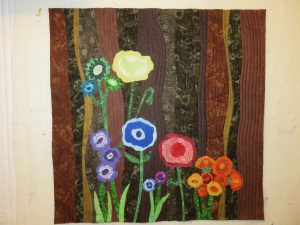
Colour Garden
The first finished project is a small (20”x20”) wall hanging that I completed in one week as part of a challenge series. The challenge of this one was to use 6 rich browns as well as 36 colours based on a 12-step colour wheel – that is, 12 hues with a tint and a tone or shade of each hue. As an added challenge, the project was to have some reference to the colour wheel.
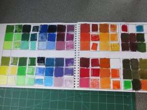
I started by taking out some acrylic paints and mixing colours to create a palette for the project.
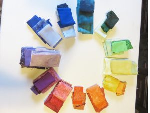
Using the results of that experiment, I moved to collecting all my colours. Although I took more time than I would have liked to find the full range, I did manage to do that using materials at hand. I incorporated some of my hand-dyeing experiments but I’m still at the playing stage on that and not yet getting the control I would like to do a full colour wheel – not yet, that is.
Getting a strong collection of browns proved a little more difficult than anticipated. The challenge stated colours should be made from combination of complementary colours with result leaning to each end of the spectrum. So, browns created from a mix of red and green and choosing one more green and one more red. It took a bit of manipulation to find browns that were rich and I had a really hard time finding the spectrum in materials. Finally, I managed to find browns leaning to red and to green, to violet and to yellow, and to blue and to orange. It was a learning experience for sure. (Ooops. I set up a picture with the selected browns next to related colours on the wheel but apparently I forgot to actually take a good picture. Not like me to miss the photo opp but what can I say? Sorry about that. You can see the combination on the finished project.)
My original thought for the design was to go with something abstract while I was out taking some pictures in the garden, I noticed that with a shallow depth of field (blurred background), I could see various browns in with the greens in the background. As a result, I decided to go with a representational garden.
Here is my finished project.
I used gentle curves and simple straight quilting in the background because I wanted the look of wild flowers at the edge of a woods. To meet the criteria of reference to the colour wheel, I made the primary colours the largest, the secondary colours smaller and the tertiary colours still smaller. I used a flat facing to the back rather than a visible binding. This was a fun little project. I’m making a class from this one.
Sunset Improv
The second finish this week was inspired by a recent course by Krista Hennebury. In the workshop, called Improv Under the Influence, Krista shared some techniques for modern quilting with a traditional influence. I wrote a little about this fun session in a recent post on Improv Quilting
In that post, I indicated that I was still playing with warm and cool colour strips, deciding how to assemble them. I included this picture to show my progress with the strips.
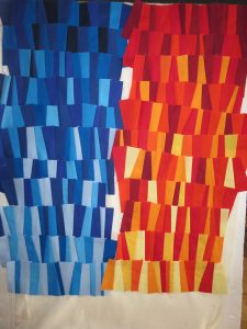
I started making all my strips mixed colours but decided that I wanted to do them with a spectrum of [mostly] light to [mostly] dark.
I wanted to have the sky light reflected in the water so I created a land mass as a horizon line 1/3 from the top and put some of the warm red, yellow and orange strips below the land then quilted to represent ripples in the water. I couldn’t resist adding a sailing boat because – well, I’m a coastal girl, after all. This is not a usual style for me but I am quite pleased with the result.
Fun with Colour
What have you been doing with colour lately? Have you ventured into new combinations or tried a limited palette? Try looking at the world through rose coloured glasses – or maybe through red, green or yellow filters. You never know what new colours or combinations might inspire you.


Recent Comments