Recently, I have had a number of discussions with different quilters about their difficulties choosing colours for their projects. This seems to be a recurring source of confusion for many. People have a number of ways to avoid the frustration including using the same colours as a pattern, buying fabric in collections or pre-cuts or recruiting friends or fabric store staff to help. In fact, they may not even think about colour unless it is time to assemble materials for a specific project, either from new fabric or from an existing stash.
On several occasions in the past few months, I have heard fabric artists say that they would like to learn more about colour combinations so I’ve decided to take up that challenges with a series of colour study exercises – and to invite others to take them on with me.
I am not going to reinvent the [colour] wheel (OK, pretty bad — actually used that clichéd expression without thinking then couldn’t resist adding the descriptor). There are lots of wonderful resources available and I will share some in future posts. My focus is going to be on using colour to create a mood or effect in fabric but to get there, it is useful to first study how to create colour.
Additive and Subtractive Colour
There are two colour wheels that are commonly used – one based on primary colours of Red, Green and Blue, often called painter’s primaries, and the second based on Magenta, Yellow and Cyan, known as the printer’s primaries or Ives colour Wheel. You might recognize these as RGB and CMYK colour systems.
In basic terms, the difference between the two comes from the ways that colours are created. With the additive colour method (RGB), you start with black and add light to create colour. You can think of this as mixing with light. Its applications include TV, computer monitors and stage lighting.
By contrast, in using subtractive colour (CMYK), you start with white and filter unwanted wavelengths. Painters doing this with their colour pigments – mixing with inks. 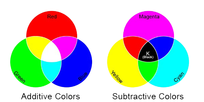
Image via UpVector
Colour wheels based on the two systems differ somewhat.
Challenge 1: Preparation
- Decide what colour wheel you prefer. I have been doing some playing with a wheel based on Cyan, Magenta and Yellow. You can see some of my efforts on an earlier post on Colour Theory. I have enjoyed working with comparisons on that wheel but for this series of challenges, I have decided to use the Painter’s Primary based on Red, Green and Blue. I like the connection with painters through history, though I’m definitely not a painter. I will be doing a 12-step wheel but you might feel ambitious and want to go for a 24 step spectrum.
- Gather colours for mixing. You could use paints, pencils or pastels. I’ll be using acrylic paints. They are easy to mix, dry quickly and are readily available and not too expensive. Mixing colours will help create a better understanding of the effect of mixing and will also make a good foundation for selecting fabrics in future challenges. To begin, you will need the primary colours for your wheel plus black, white and grey (optional if you prefer to mix a grey from black and white).
- Choose a way to collect your exercises for reference. There are many options – a spiral bound note book of varied sizes, a binder, poster boards – or a combination of any of these or other approaches.
Join me next week for the first hands-on exercise. I’ll be experimenting with shades, tints and tones.
Have you spent time focused on learning colour? What strategies did you use? What colour wheel will you use for the challenge and why?
Recent Comments